
Maybe I’m not wired like everybody else, but I sometimes have difficulty following maps, whether they be old-fashioned printed ones or on websites and apps.
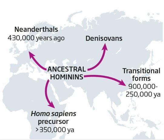
Take this map posted on Twitter by New Scientist magazine to demonstrate some early form of tourism — the evolution and movement of different hominids who existed before modern humans.
I had difficulty with the graphic. If I’m looking at a map, my mind instinctively decodes blue as ocean, but here the landm is blue, the ocean white.
Even though the shapes of the continents ought to be familiar to me, it took a few seconds for me not to “read” it the wrong way.
Is it just me, or is this something graphic designers at New Scientist and elsewhere should address?
